Navigation Redesign
Reducing Mental Load and Time Navigating for Parking OperatorS
Released Q3 2024
Released Q3 2024
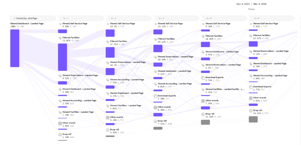
Parking is shockingly complex. Reports and data do take time to digest, especially when people are operating multiple locations and need to configure specific exports for their own reporting. Our goal was not to eliminate the time spend in the Control Panel, but reduce the amount of tedious selections required to get around. These metrics show that we were successful.
“User friendly. Easy to maneuver”
“Extremely concise yet exact and easy to navigate and update quickly, which can mean a big difference in profits vs loss.”
“Great experience, things are very intuitive. Love accessing pages multiple ways. Great work!”
“The absolute convenience and simplicity of this application has helped me tremendously grow my location’s profit.”

I worked on or helped with all of the projects in 2023 and 2024 that helped improve the NPS score of the Control Panel. This navigation update was a very large part of the uptick of positive feedback and reviews.
Facility selection in a dropdown. Laggy performance and loading, hard to use filters.
Pages with single facility usage were cumbersome and confusing to toggle between which facility was in view
Pages list added to ad-hoc as the product developed features over time
‘Sign Out’ one of the most prominent buttons on every page — why subconsciously encourage people to leave?
Facility selection surface level along the left pane with infinite scroll loading patterns and easy and fast to search and filters.
Pages with single facility usage now behave the same as multi-select and it’s easy to tell which location is being viewed and to toggle between different facilities
Pages grouped in intuitive ways based on the content and usage
New account menu dropdown to sign out, with other links to the new help center, change passwords and account details, and to contact support
Hypothesis: the navigation directly impacted only 22% of users taking action on their visits. Our goals are to increase actions taken to have all locations responding to market conditions. If the tool us cumbersome to use, then of course people won’t make changes or keep things up to date.
It’s not intuitive how select different locations/facilities on any given page
Uncertainty about how to find information or actions
It takes too much time to navigate, reducing user engagement.
Repeated facility switching was the most common action for operators to do. This resulted in a clunky, cumbersome experience, since the facility selection process was not easy to do.
Low quality image. So sorry!!
I ran an internal card sorting exercise with 35 users of the Control Panel. Some were power users and some were those new to the org who would have little context on what the different titles meant to get a breadth of responses. People answered from product, design, engineering, finance, revenue, and analytics.
I chose not to have this externally facing since the tools to host card sorting were not very good and we did not want to expose our low-tech-savvy operators to what we had available to use and risk having them have a negative experience.

I used this and other feedback to then form our first set of menus, which I then changed through rounds of feedback and usability sessions.
We knew facility selection was the most important to get right, so that should be first. I did extensive research into the best practices in UI and product design for how navigation should be built so we could use the knowledge of our community to help this along. I did not need to re-invent the navigation wheel! This article in particular really helped to rule out some of the ideas which were generally considered lower performers and I did focus more on the better performance options.

I tried taking us right from the basic layout all the way through with some proposed ways to organize our content.
I facilitated multiple ideation sessions with designers and engineers to get a broader sense of navigation ideas. These also included manual card sorting exercises to validate page groupings.
For each desktop view, we needed to optimize for mobile! Some layouts would have been a nightmare on mobile (like these) and so were ultimately discarded.
Different layouts for facility selection that we did not go with.


Ready to Test
I made this version of the new navigation into an interactive prototype to enter into our first round of usability tests.

Pathway I mocked up in a prototype to ensure the tester was going between multi-facility-select and single-facility-select pages.


I made sure to capture a breadth of experience with the Control Panel in the internal and external people I recruited. That way, the design would accommodate both the lower usage non-industry folks right up to the power users with hundreds of locations to manage every day.
Validated the ease of use on mobile — this was very straight forward and made perfect sense to people (wow!)
Filters were hard to know what was applied and where to search or filter which location
Default filtering to only those locations ON would be the most intuitive across the board, hiding archived or off locations unless filtered
Search needed to include 2 different location IDs, the address, the facility name, and the canonical facility grouping address
The landing page (Dashboard) needed to NOT be inside a menu, and instead be its own menu item along the top level
Menu item groupings needed to be by vertical rather than by action type. Eg. Rather than having all rates actions and all inventory actions together, instead group by monthly, airport, transient, and events and have rates and inventory in each. This fit the mental model of all users in a more intuitive way when trying to find information.
Multi-facility-select and single-facility-select pages were hard to tell the difference and so more clues and context in the UI was needed. Ultimately this meant adding/removing check boxes in a dynamic way for the facility list and including a “portfolio view” banner when you can select multiple facilities on an aggregate page.


Mobile Menus


This was only a snapshot of some of the highlights and nuance of the project.
Be sure to ask about this project when we chat if you want to hear more about my process or work.
