tilr: App Home Redesign
Connecting Users with Important App Actions
Project Completed in 2019
Project Completed in 2019
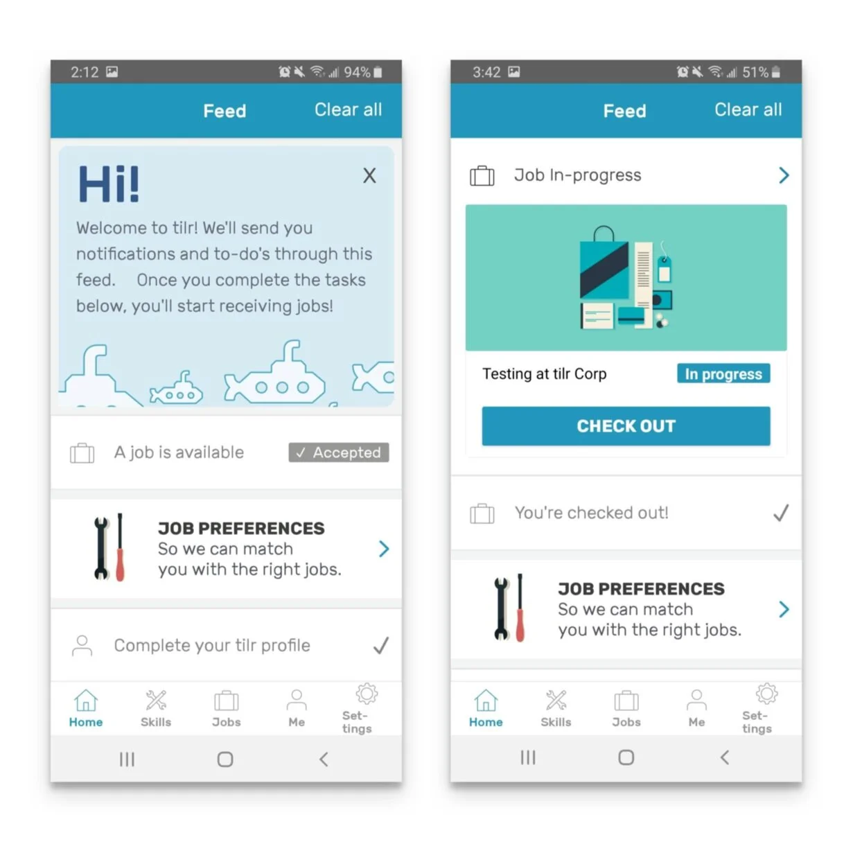
We found these problems with the current solution (pictured) and were seeking solutions to resolve them.
Feed has so many different types of things, people would have hundreds of items to address and do none of them.
People don’t notice when they have a new job offer. It gets lost in all of the things going on.
Onboarding tasks are forgotten because nothing seems important.

Preliminary research into our user base revealed some characteristics…
Takes transit to get to and from jobs
Low income (on social assistance programs)
Often no bank account (!!)
May be re-entering the workforce from time away
Hop from job to job
Plenty of seniors - supplementing a fixed income
Less intercom complaints and questions about how to find basic functions
More people completing the onboarding tasks

We wrote a series of user stories to orient the most important actions around business and worker goals. Then generated groupings of tasks to launch people from the Home to the part of the app to perform that action.
Remove job cards from Home, and create a card that would take the worker to perform that action on the job details page under Jobs. Check in/check out, accept/decline actions all moved to respective job but Home would indicate an action is needed.
This is the biggest impact because the people who had hundreds of Feed items were flooded with job cards with actions to perform on them. Removing the action and creating bundles of actions is the way to keep this area of the app concise.
Before jumping into Sketch to make any greyscale wireframes, we cut out all of the different tasks and grouped them into scenarios for the first mock ups. Then I took all of this information, along with external research into card behaviour and other dashboards, and made some sketches of what I planned to put into greyscale wireframes.


3 Scenarios, mapped out into the following options:
Digital Sketch - putting the decided scenarios into Sketch
Option 1 - List format, similar to current UI
Option 2 - Tile/Card format with a large Onboarding prompt stuck to the top
Result - after being presented with these options for all of the scenarios created previously, we decided to move forward with the tiled view.
These designs are a step in the right direction for eliminating the problematic clutter. The calls to action are clear, explaining what will happen next and what to do next. The UI is designed with writing at a grade 6 level to accommodate as many people as possible. The tiles are also created to be more accessible to seniors.


One of the highest priority success metrics was about having a higher completion rate for onboarding tasks. It used to be that tasks to do would be lost among the long list of other to-do’s in the Feed. Now there is a large progress indicator card at the top of the worker’s home screen if they have more actions to complete. Clicking on that will lead them to the wireframe featured here.
Another designer was re-designing our entire onboarding flow, so this screen had to make sense with where their designs left off and to move workers forward if they skipped any steps in that new flow.

Before release, I conducted a series of in-house usability testing to find out a number of things.
Do the icons and copy make sense for the tasks to perform?
To perform tasks coming from the Home, is it clear where you will go and what to do there?
What I found was more direction on icons and copy to make things clearer, and was able to iterate from the results of these tests.

Iterations for a feature we call “Job Interest” which is a tinder-swipe action performed on local jobs you want to be considered for. After testing these, finding out what each of them is communicating, I found the suitcase one, second from the left, was the most clear.

After all of the designs were finalized, it was time to handoff to our developers. Throughout this process I presented the designs, right from greyscale to the end. This way the developers knew what was coming and could plan for it. It also meant that they knew what they needed from me in order to make this come to life.
A document was created to explain the importance of each item, which will override which other ones, and to give a map for where each tile will lead to in the app. It gave us a common language to use between design and development and worked well as a communication tool.
We continued to monitor the metrics tied to the success indicators mentioned above to see if these designs truly are a solution to the problems we saw. Since we went into this project trying to be as educated as possible about our users, the app, and the problems needing to be solved for, this iteration of the Home was definitely a major improvement in many ways over the existing Feed. What we saw was a measurable reduction in the need for navigational help from our customer success team, and as a result they could focus on the issues that truly required human intervention to solve.
